The LearnDash Course Grid feature displays courses in a visual, grid-style layout. This layout helps learners easily browse available courses and works especially well on larger screens.
The Course Grid is built to be user-friendly, with full support for the WordPress Block Editor. It includes customizable visual styles (called skins), built-in filtering options, and a variety of display settings. These tools make it easy to tailor the course grid to match the design and goals of any LearnDash site.
This article provides a step-by-step guide to setting up the Course Grid and explores the available options for customizing how courses are displayed.
NOTE: The Course Grid can be used to display lessons, topics, or quizzes in a grid, as well.
Features Included in the Course Grid #
The Course Grid feature offers a wide range of options to help display and organize LearnDash courses in a way that fits each site’s goals and branding. From visual styling to filtering tools, these built-in features give course creators the flexibility to create a customized browsing experience for learners.
- Display courses in columns
- Customize number and sort order of courses
- Filter courses by category or tag
- Show only enrolled courses
- Show/hide course image
- Include a video preview
- Include a short description
- Include a call-to-action (CTA) button
- Customize button text
- Include a price ribbon
- Customize ribbon text
- Show/hide course progress bar
- Use on unlimited pages and multiple times per page
- Search courses
- Filter courses
- Change skin
Using the Course Grid #
There are two ways you can add a grid to any page on your LearnDash site:
- Block: Best for those using blocks editor such as Gutenberg. This is primarily the main option available for Course Grid 2.0
- Shortcode: Best for those using page builder plugins (Elementor, Beaver Builder, Divi, etc.) or the WordPress Classic Editor. The options may be limited while using shortcodes versus the blocks editor version of Course Grid.
Developers Note: You can also add the course grid shortcode to your theme files via the do_shortcode() function.
Block #
Blocks are available if you’re using the WordPress Block Editor. You’ll have more features and options than the shortcode provides, and the LearnDash Course Grid block makes it even easier to insert and customize your grid.

To add a course grid block:
- Make sure the LearnDash Course Grid plugin is installed and activated
- Click the
+icon to add a new block - Search for “LearnDash Course Grid” and click on the block to insert it
- Adjust your settings in the Block options panel
Shortcode #
NOTE: There are two sets of shortcodes that you will need for the Course Grid. If you are using Course Grid 1.0, proceed with the examples below. For course Grid 2.0, check further down.
For Course Grid 1.0, you may use these shortcodes and parameters. The shortcode to insert a course grid looks like this:
[ld_course_list]The default options for the course grid will display your courses in 3 columns, and include:
- Featured image (if it exists)
- Course title
- Short description (if it exists)
- Button
- Ribbon

Please see the options table below for the many ways in which to customize the course grid.
Course Grid 2.0 shortcodes and parameters: #
LearnDash Course Grid #
[learndash_course_grid]Accepted attributes: #
Query #
This part handles the posts query part of the shortcode. You can configure how you want to retrieve posts data in your course grid.
- Post_type: any public and queryable registered post type. Default is sfwd-courses.
- Per_page: number of posts per page. Default is 9.
- Orderby: how the results are ordered by (see https://developer.wordpress.org/reference/classes/wp_query/#order-orderby-parameters). Default is ID.
- Order: how the results are ordered. Accepts ASC (Ascending) or DESC (Descending). Default is DESC.
- Taxonomies: display posts by certain categories. Accepts the following format: taxonomy1: term1, term2; taxonomy2: term1, term2; taxonomy3: term1, term2; and so on. Default is empty.
- Enrollment_status: accepts enrolled, not-enrolled, or empty value. Default is empty which means all statuses.
- Progress_status: accepts completed, in_progress, not_started, or empty value. Default is empty which means all statuses.
Elements #
This part is responsible for displayed card elements in your course grid. Most attributes are a toggle that can be switched between on and off for elements in your card design.
To prevent an element from showing, set the parameter for that element as empty. If you want to prevent the thumbnail from showing on the course grid, the shortcode would look like the following:
[learndash_course_grid thumbnail=""]Each card has different available elements.
- Thumbnail: accepts
"true"or"". Default is"true". - Thumbnail_size: any registered image size in the site. Default is
"thumbnail". - Ribbon: accepts
"true"or"". Default is"true". - Content: accepts
"true"or"". Default is"true". Content includes all elements outside of the thumbnail. So if you want to display a thumbnail-only grid you can turn this off. - Title: accepts
"true"or"". Default is"true". - Title_clickable: accepts
"true"or"". Default is"true". Whether the title is clickable or not. - Description: accepts
"true"or"". Default is"true". - Description_char_max: accepts any positive number. Default is
"120". Maximum number of characters that will be displayed in the course grid description. - Button: accepts
"true"or"". Default is"true". - Filter: accepts
"true"or"". Default is"true". Whether the course grid has filters above it or not. - Pagination: accepts button (load more button) or infinite (infinite scrolling). Default is
"button". - Progress_bar: accepts
"true"or"". Default is"". - Post_meta: accepts
"true"or"". Default is"true". Meta is any kind of post’s additional information such as author, categories, etc.
Template #
This part handles the template part of the course grid.
- Skin: accepts skin key registered on the site. By default CG 2.0 comes with 2 skins: grid, masonry and list. Default is
"grid". - Card: accepts card key registered on the site. Each skin can have different cards. By default CG 2.0 comes with grid-1, grid-2, grid-3 cards ( for grid and masonry skin ) and list-1, list-2 cards ( for list skin ). Default is
"grid-1". - Columns: accepts positive numbers. How many columns will be displayed on grid and masonry skin course grid. Default is
"3". - min_column_width: in pixel. What is the minimum number of column width pixels allowed on the course grid. Default is
"250".
Styles #
This part handles the style aspects of the course grid. #
- font_family_title: define font family will be used for the course grid card title. Default is empty and follows the theme font family.
- font_size_title: accepts full font size format such as 18px, or 1.2rem. It defines the font size of the course grid card title. Default is empty and follows the theme font size.
- font_color_title: define font color of the course grid card title. Default is empty and follows the theme font color.
- background_color_title: define background color of the course grid card title. Default is empty and follows the theme background color.
- font_family_description: define font family will be used for the course grid card description. Default is empty and follows the theme font family.
- font_size_description: accepts full font size format such as 18px, or 1.2rem. It defines the font size of the course grid card description. Default is empty and follows the theme font size.
- font_color_description: define font color of the course grid card description. Default is empty and follows the theme font color.
- background_color_description: define background color of the course grid card description. Default is empty and follows the theme background color.
Filter #
This part is responsible for defining the available filters on the course grid. This part will be used only if the filter attribute is set to true.
- filter_search: accepts
"true"or"". Default is true. If enabled, search by keyword filter will be available on the course grid. - filter_taxonomies: accepts taxonomy slugs separated by comma. Default is
"category,post_tag". Display filter by taxonomies in the course grid. - filter_price: accepts
"true"or"". Default is true. If enabled, a price filter will be displayed on the course grid. Currently the price filter only supports LearnDash Course and Group by default. It supports other post types via filter hook. - filter_price_min: accepts a positive number set as minimum price in the price filter slider. Default is 0.
- filter_price_max: accepts a positive number set as maximum price in the price filter slider. Default is 1000.
Miscellaneous #
- id: Required. Accepts a random and unique string used for the ID attribute of the course grid. Its required to make custom styling and filter work.
- class: accepts random string added to the course grid. This is optional.
Example:
Minimum working shortcode example:
[learndash_course_grid id=cg-1]LearnDash Course Grid Filter
[learndash_course_grid_filter]This shortcode is useful if users want to output course grid filter separately from the main course grid. For example users want to display a course grid on a page and display its filter in the sidebar.
Accepted attributes: #
- course_grid_id: Required. The value must match the id attribute of the learndash_course_grid shortcode attribute to make the filter work properly.
- search: accepts
"true"or"". Default is true. Whether to display search by keyword filter or not. - taxonomies: taxonomy slugs separated by comma. Default is category, post_tag. Taxonomies that will be displayed as the course grid filter.
- price: accepts
"true"or"". Default is true. If enabled, a price filter will be displayed on the filter. Currently the price filter only supports LearnDash Course and Group by default. It supports other post types via filter hook. - price_min: accepts a positive number set as minimum price in the price filter slider. Default is 0.
- price_max: accepts a positive number set as maximum price in the price filter slider. Default is 1000.
Example: #
Minimum working shortcode example:
[learndash_course_grid_filter course_grid_id=cg-1]Options (Blocks Parameters) #
The following options are available to customize the output of your LearnDash course grid.

Template #
This set of options allows you to customize how your course grid is rendered and formatted on the page. You can select different skins, card styles, and choose the number of columns on each grid.
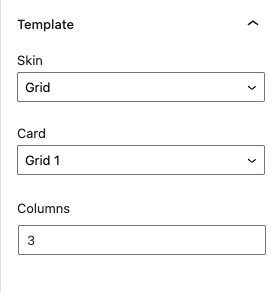
Skin #
With Course Grid 2.0 comes the introduction of different “Skins” to the course grid. You are no longer stuck with just a simple grid style, here you can select:
- Grid
- Masonry
- List
NOTE: You can also implement your own “Skin” by modifying the Child Themes. Check out our Course Grid 2.0 templating guide to learn how.
Card #
This setting allows you to choose between the different pre-made layouts for each type of skin. Pick one to your liking.
Columns #
This setting allows you to customize the number of columns your course grid will display the cards in. The default is 3.
Min Column Width #
This setting allows you to customize the minimum column width of each of the columns. If the column width reaches a value lower than this, the grid columns number will automatically be adjusted on display.
Query #
This set of options allows you to customize which post types and how many are shown on each page of the course grid. This also allows you to customize which order you want them to be displayed.

Post Type #
With Course Grid 2.0, you can now select a variety of post types to be displayed on the course grid. You have a vast set of options available that depends on your website, as long as the post type can be queried publicly. If not, the Course Grid will not be able to show the posts.
Posts Per Page #
This setting allows you to indicate how many posts are displayed per page on the Course Grid. You can further customize the pagination options with its own set of options below.
Order By #
This setting allows you to choose by which order you want the items to appear on the page. You can select by:
- ID
- Title
- Published Date
- Modified Date
- Author
- Menu Order
Order #
This allows you to choose whether to display the cards in Ascending or Descending order based on the Order By ” setting above.
Taxonomies #
Used to display a listing of content based upon configured taxonomies like categories and tags. You can use ld_course_tag and ld_course_category taxonomies for filtering. For more information about LearnDash categories and tags, please visit this Knowledge Base document.
Enrollment Status #
Only available when using Courses/Groups as the post type, you can filter the results by whether the user is currently enrolled into the course/group.
Elements #
This next tab allows you to further customize your Course Grid tabs by adding or removing certain elements such as the ribbon, title, etc. These options were previously available as shortcode options on the original Course Grid add-on.
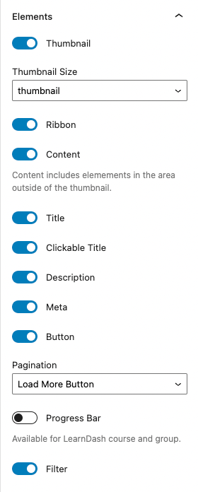
Thumbnail #
This setting gives you the option to show or hide the thumbnails of each card. Do note that the thumbnails are based on the featured images on the original Course, Topic, Lesson, etc.
Featured Image #
The featured image is a standard feature of WordPress. The LearnDash Course Grid add-on will use this image, if youve uploaded one. To set a featured image for your course:
- Go to LearnDash LMS > Courses
- Click on the course youd like to add an image to
- In the sidebar, look for an area titled Featured Image
- Click Set featured image
- Choose your image from the Media Library, or upload a new one
- Click the Select button at the bottom
- Dont forget to click Update to save the changes

NOTE: Most WordPress themes will also display the featured image near the top of your course page. This is solely dependent on your theme, and out of LearnDash’s control. Please contact your theme developer if you have questions regarding images on your individual course page.
Thumbnail Size #
This setting allows you to choose the thumbnail size of your Course Grid card. The preset sizes are dependent on the available sizes on your WordPress site.
Ribbon #
A course ribbon is a small piece of information displayed in the top-corner of each course in your grid. Its displayed over top of all other content, and the text it displays depends on
- The specific user viewing your grid, and their enrollment status
- The course access mode for that particular course
If the user viewing the course grid has completed the course, then the ribbon will say Completed.
If the user is enrolled in the course, but has not completed it,then the ribbon will say Enrolled.
If the user is NOT enrolled in the course
- And the Access Mode is set to Open or Closed (no amount entered under the Course Price field), then no ribbon will be displayed.
- And the Access Mode is set to Free, then the word Free will be displayed.
- And the Access Mode is set to Buy Now, Recurring, or Closed, the amount entered in the Course Price field will be displayed.
If no amount is entered in the Course Price field, then no ribbon will be displayed.
See below for how to customize the ribbon text.
Content #
Content includes elements in the area outside of the thumbnail such as:
- Total Students
- Total Quizzes
- Total Lessons
- Title
- Author
- and others…
Title #
This setting allows you to choose whether or not to show the title of the course.
Clickable Title #
This setting allows you to choose whether or not to make the title of the course clickable. If you enable this setting the user will be redirected to the respective course page.
Description #
This setting allows you to choose whether or not to show the description of the course. See below on how to customize the course description.
Meta #
This setting allows you to choose whether or not to show the meta description of each course on the grid.
Button #
By default, all courses in your grid will include a CTA button that says, See More. This language remains the same for enrolled users, non-enrolled users, and completed courses.
See below for how to customize the button text on a course-by-course basis.
Pagination #
This setting allows you to choose the different pagination options for the course grid. If you have more courses, lessons, topics, etc. than you allow to be shown on the “Posts Per Page” option above, then you must select a pagination option to display the rest of the items.
You can choose from:
- Load More Button
- Infinite Scrolling
- Disable
Progress Bar #
This setting is only available for LearnDash courses and groups. This allows you to choose whether or not to display the progress bar, a visual indicator of a students current progress in each course.
NOTE: A progress bar is only shown on courses in which the user is currently enrolled or has completed.
Filter #
With the launch of Course Grid 2.0, this option was added to allow you to add a filter option on your course grid for your users. If this option is selected the below “Filter” settings are shown and are available for you to customize.
If this option is enabled, a Filter button will show on the top-right corner of the user’s screen.
Filter #
This tab allows you to customize the “Filter” option on your Course Grid. You will be able to select different categories that the users can use to filter their courses.
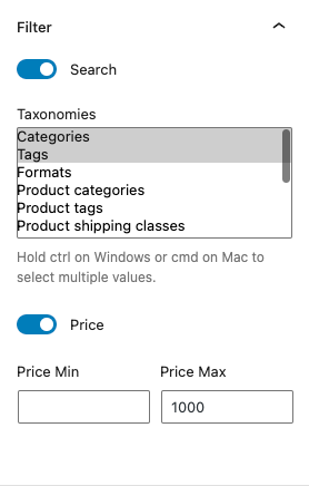
Search #
This setting lets you choose whether or not to have a search option on your filter options. If this is enabled, the user will see a search box where they can input keywords in order to filter out your courses on the grid.
Taxonomies #
This setting allows you to choose different taxonomies that your users can use to filter out your quizzes. As long as these taxonomies are public-facing, then you’ll be able to select them.
To select multiple taxonomies, hold the ctrl or cmd button on your computers.
Price #
This setting allows you to set the minimum and maximum prices that users can use to filter your courses. If you leave them blank, it will default to the minimum and maximum price of your courses.
Styles #
This tab allows you to further customize your Course Grid by letting you choose from a myriad of style options including changing the fonts and colors of both the heading and the description.

Equal Grid Height #
This setting allows you to choose whether or not to set the grid height to be equal. This will change the layout of your Course Grid based on your selected “Skin” above.
Heading #
These set of options allows you to change the heading style for your course grid. You can customize the:
- Heading Font family
- Heading Font size
- Heading Font color
- Heading Background color
The color picker is also readily available for you to use when picking colors.
Elements #
These set of options allows you to pick and change the colors of certain elements in the course grid. These include:
- Ribbon font color
- Ribbon background color
- Icon color
- Icon background color
Options (Shortcode Parameters Course Grid 1.0) #
The following options are available to customize the output of your LearnDash course grid using a shortcode. Multiple parameters can be used at the same time, in any order. Mix and match them to create the perfect course grid for your site. These, and more, parameters and options are available on the blocks mentioned above.
NOTE: Most of these shortcodes are not available nor cannot be used with Course Grid 2.0. Please see the note above.
| Feature | Description | Parameter | Possible Values |
|---|---|---|---|
| Grid Columns | Number of columns your grid will have on large screens. | col="4" | 1, 2, 3, 4, 5, 6 |
| Progress Bar | A visual indicator of a student’s current progress in each course. | progress_bar="true" | true |
| Number of Courses | How many courses will be displayed in your grid. | num="10" | any integer |
| Course Sorting | How to sort the courses in your grid. | orderby="title" | titleIDdatemodifiedmenu_orderrand…and more |
| Order of Sorting | The sort order for the “orderby” parameter. | order="ASC" | ASCDESC |
| Hide Content | Hide the title, description & button. | show_content="false" | false |
| Hide Thumbnail | Hide the thumbnail image. | show_thumbnail="false" | false |
| My Courses | Shows only the courses in which the current user is enrolled. | mycourses="true" | true |
| Not-Enrolled Courses | Shows only the courses in which the current user is NOT enrolled. | mycourses="not-enrolled" | not-enrolledenrolled |
| Course Status | Shows only the courses in which the current user is enrolled AND completed. NOTE: The mycourses parameter must be set to enrolled for it to show. | status="completed" | completedin_progressnot_started |
| If using LearnDash categories & tags… | |||
| Course Category ID | Shows only courses in the specified LearnDash category. Use the category ID. | course_cat="10" | any course category ID |
| Course Category Name/Slug | Shows only courses in the specified LearnDash category. Use the category slug. | course_category_name="math" | any course category slug |
| Course Tag ID | Shows only courses tagged with the specified LearnDash tag. Use the tag ID. | course_tag_id="10" | any course tag ID |
| Course Tag Name/Slug | Shows only courses tagged with the specified LearnDash tag. Use the tag slug. | course_tag="math" | any course tag slug |
| Course Category Selector | Adds a dropdown menu to filter the course grid by course category. | course_categoryselector="true" | true |
| If using WordPress categories & tags… | |||
| WordPress Category ID | Shows only courses in the specified WordPress category. Use the category ID. | cat="10" | any WordPress category ID |
| WordPress Category Name/Slug | Shows only courses in the specified WordPress category. Use the category slug. | category_name="math" | any WordPress category slug |
| WordPress Tag ID | Shows only courses tagged with the specified WordPress tag. Use the tag ID. | tag_id="10" | any WordPress tag ID |
| WordPress Tag Name/Slug | Shows only courses tagged with the specified WordPress tag. Use the tag slug. | tag="math" | any WordPress tag slug |
| WordPress Category Selector | Adds a dropdown menu to filter the course grid by WordPress category. | categoryselector="true" | true |
Columns #
Columns determine the number of columns that will be used to display your courses on larger screens. On smaller screens and mobile devices, fewer columns will be used. This is scaled automatically for you. Default is 3 columns. Maximum is 6 columns.
Example using 4 columns:
[ld_course_list col="4"]Progress Bar #
By default, no progress bar is shown. To add a progress bar to the courses in your grid:
[ld_course_list progress_bar="true"]NOTE: A progress bar is only shown on courses in which the user is currently enrolled, or has completed.

Number of Courses #
This option lets you limit the number of courses shown on the page. If there are more courses than the number you specify, pagination links are shown below the grid, allowing the user to navigate all courses. Default is all courses.
Example showing only 2 courses:
[ld_course_list num="2"]Sort Order #
You can customize how your courses are sorted within your grid using a combination of the orderby and order parameters. orderby tells LearnDash which piece of information you’d like to sort by, and order determines which direction the sort should occur (i.e. forwards or backwards).
Example sorting by the original publish date, most recent to oldest:
[ld_course_list orderby="date" order="DESC"]See the options table above for a full list of sorting parameters.
Hide Content or Image #
You can choose to show or hide different content for each course in your grid. You have two options:
show_content="false"will hide the course title, short description and CTA buttonshow_thumbnail="false"will hide the course image
Example hiding the content, only displaying the course image:
[ld_course_list show_content="false"]Enrolled or Not-Enrolled Courses #
If you’re looking to create a unique profile page for registered users, or a sales page to promote courses to non-enrollees, these options are for you.
mycourses="true"will only display the courses in which a user is enrolledmycourses="not-enrolled"will only display the course in which a user is NOT enrolled
Example showing only a user’s registered courses:
[ld_course_list mycourses="true"]Dropdown Menu Filter #
If you’re using categories to help organize your courses, you can add a dropdown menu to the top of your grid that will filter the courses based on their category. The user can open the dropdown menu and select a category.
If you’re using LearnDash’s categories:
[ld_course_list course_categoryselector="true"]If you’re using the default WordPress categories:
[ld_course_list categoryselector="true"]See below for more complex examples on how to combine multiple parameters to customize your course grid.
Featured Image #
The featured image is a standard feature of WordPress. The LearnDash Course Grid add-on will use this image, if you’ve uploaded one. To set a featured image for your course:
- Navigate to LearnDash LMS > Courses
- Click on the course you’d like to add an image to
- In the sidebar, look for an area titled Featured Image
- Click Set featured image
- Choose your image from the Media Library, or upload a new one
- Click the Select button at the bottom
- Don’t forget to click Update to save the changes
You also have the option to hide the featured image in your course grid. Use the show_thumbnail parameter, like this:
[ld_course_list show_thumbnail="false"]NOTE: Most WordPress themes will also display the featured image near the top of your course page. This is solely dependent on your theme, and out of LearnDash’s control. Please contact your theme developer if you have questions regarding images on your individual course page.
Ribbon #
A course ribbon is a small piece of information displayed in the top-corner of each course in your grid. It’s displayed over top of all other content, and the text it displays depends on…
- the specific user viewing your grid, and their enrollment status
- the course access mode for that particular course
If the user viewing the course grid has completed the course, then the ribbon will say Completed.
If the user is enrolled in the course, but has not completed it, then the ribbon will say Enrolled.
If the user is NOT enrolled in the course…
- And the Access Mode is set to Open or Closed, then no ribbon will be displayed.
- And the Access Mode is set to Free, then the word Free will be displayed.
- And the Access Mode is set to Buy Now or Recurring, the amount entered in the Course Price field will be displayed.
If no amount is entered in the Course Price field, then no ribbon will be displayed.
See below for how to customize the ribbon text.
Call-to-Action Button #
By default, all courses in your grid will include a CTA button that says, “See More…”. This language remains the same for enrolled users, non-enrolled users, and completed courses.
See below for how to customize the button text on a course-by-course basis.
Additional Grid Information #
The Course Grid add-on allows you to add a few additional pieces of information about your courses that you present to your users in the grid. All of them are optional.
- Go to LearnDash LMS > Courses
- Click on the course you’d like to edit
- Click on the Settings tab
- Scroll down until you see Course Grid Settings
- Enter as much or as little information as you’d like
- Be sure to click Update when you’re finished

Short Description #
The short description is a brief explanation of the course. It will be displayed immediately below the course title. We recommend no more than 2 sentences and somewhere around 15-25 words.
This works the same for lesson, topic and quiz grids, too.
Duration #
Indicate the number of hour(s) and minute(s) it takes for this course to be completed. This setting does not enforce a time limit or minimum amount of time the user can spend on a course. It just shows the ideal length of time that should be spent on the course.
Custom Button Text #
By default, each course in your grid will include a button that says “See More…”. This button links to your course. If you’d like to change the text on the button to something other than “See More…”, you can do so.
This works the same for lesson, topic and quiz grids, too.
Ribbon Text #
This field allows you to override the default text displayed on the ribbon. Keep in mind, if you use custom ribbon text, it will apply to all users, whether or not they are enrolled, and whether or not they have completed the course.
Ribbons are only displayed on course grids, not on lesson, topic or quiz grids.
Video Preview #
The video preview option allows you to embed a video instead of displaying a course image. This is great for providing a quick introduction to your course, especially if you’re trying to entice users to sign up for or purchase the course.

- Check the box next to Enable Video Preview
- Add a Video URL or Embed Code
Paste the direct video URL (or embed code) of the video you want to use in the grid. If you have a video file URL, then you can use the video tag to embed your video like this:
<video controls><source src="video-file.mp4" type="video/mp4"></video>This works the same for lesson, topic and quiz grids, too.
Lessons, Topics & Quizzes #
You can also use the Course Grid add-on to display lessons, topics and/or quizzes in a grid format. Most of the same customization parameters apply, like:
number of columns, sorting and filtering, show/hide image and/or short description, video preview, button text
The following course grid features do not apply when displaying lessons, topics or quizzes in a grid:
- Enrolled courses only
- The progress bar
- The price ribbon
Let’s take a look at how to display each type of content in a grid.
Lessons #
To display a lesson grid, use the following shortcode:
[ld_lesson_list]To show the lessons in a particular course only, use the course_id parameter (not required when using the shortcode on a course page):
[ld_lesson_list course_id="123"]Change 123 to the ID of the course in which you want to display lessons.
Topics #
To display a topic grid, use the following shortcode:
[ld_topic_list]To show the topics in a particular course only, use the course_id parameter (not required when using the shortcode on a course page):
[ld_topic_list course_id="123"]Change 123 to the ID of the course in which you want to display topics.
NOTE: You cannot filter topics by lesson, only by course.
Quizzes #
To display a grid of quizzes, use the following shortcode:
[ld_quiz_list]To show the quizzes in a particular course only, use the course_id parameter (not required when using the shortcode on a course page):
[ld_quiz_list course_id="123"]Change 123 to the ID of the course in which you want to display quizzes.
NOTE: You cannot filter quizzes by lesson or topic, only by course. All quizzes assigned at any point during the course (lesson quizzes, topic quizzes, final course quizzes) will be displayed.
Shortcode Examples #
Here are some examples you can use when building out a grid on your site:
Display a progress bar for each course:
[ld_course_list progress_bar="true"]Display up to 8 courses in 4 columns (4×2 grid):
[ld_course_list num="8" col="4"]Display all courses and sort them in alphabetical order, by their title:
[ld_course_list orderby="title" order="ASC"]Display all courses and order them by the most recently modified course first:
[ld_course_list orderby="modified" order="DESC"]A few notes about sort order:
- When ascending (ASC) is chosen for
orderby="title", your courses would be displayed in alphabetical order from A-Z. - When using dates (
date&modified), ascending will show the oldest content first, while descending will show the most recent content first. - For
ID&menu_order, ascending will show the lowest number first (i.e. 1), while descending will show the highest number first.
Display only the courses that a user is enrolled in:
[ld_course_list mycourses="true"]Display only the courses that a user is enrolled in, and sort randomly:
[ld_course_list mycourses="true" orderby="rand"]Display a user’s enrolled courses, with a progress bar, and sort by oldest to newest (based on original publish date):
[ld_course_list mycourses="true" progress_bar="true" orderby="date" order="ASC"]Display courses in which the user is NOT enrolled, and only show the featured image (hide the title, button and description):
[ld_course_list mycourses="not-enrolled" show_content="false"]Display all courses and hide the course image (only show title, button and short description):
[ld_course_list show_thumbnail="false"]Display 2 courses, in a 2-column grid, with a LearnDash category selector filter:
[ld_course_list num="2" col="2" course_categoryselector="true"]Display all lessons in the course with an ID of 7, and sort by their order in the course builder:
[ld_lesson_list course_id="7" orderby="menu_order" order="ASC"]These are only some of the ways you can use the shortcode to customize your grid. Feel free to experiment with your own combination of parameters to create exactly the type of grid you want.