How to Choose a Kid-Friendly Design for Your Course
Whether you’re working from a template or building from scratch, these design principles for children will help you create a better course for kids.
For many years, online education has been a field primarily dominated by adults. From college courses to ongoing professional education, instructional design has focused on the priorities of these adult learners, which are very different from the priorities of children.
However, the onset of the Covid-19 pandemic has led to a sea change in online course users. Teachers are trying to find ways to migrate lesson plans online, and parents trying to figure out homeschooling are desperate for resources.
If you’re designing a course for kids, there are plenty of themes to start with. And if you have the coding skills, this is the perfect time to put them to work to create something special for your young audience.
However, as you make design decisions, whether in updating a template or building something from scratch, remember that user-friendliness matters just as much for kids as it does adults. In fact, it may be even more important, as children don’t have the self-discipline or motivation to stick with a clunky interface if they don’t like the material.
So, to create an online course that will engage younger audiences, follow these design principles.
1. Research your age group.
First of all, decide what age group you’re creating a course for. Because children develop so rapidly, if you’re off your mark by only a year or two you could completely miss your target audience.
For instance, if you’re designing for 5-year-olds, they may not know how to read your navigation. As kids get older, they become gradually more interested in more complex deigns and problem solving. Think about what material is most age-appropriate for your audience, and advance the design choices accordingly.
2. Choose bright and friendly colors.
No kid wants to take an online course with the color palette of Windows 95. Gray and blue might look suitably serious and professional from an adult course, but kids respond better to colorful content.
At the same time, don’t feel like you have to stick with only primary colors, and definitely don’t color-code your site pink or blue for girls and boys. Instead, chose complementary colors that will grab interest without being too visually loud.
3. Use simple words and large text.
What is the reading level of the kids taking your course? Remember that your learners might be at different stages within their peer group. Kids learn at different rates, and while this evens out in later years, in childhood the differences can be significant.
Write at the level of the youngest member of your group so that they aren’t left behind. And if you’re working with new readers, use a large, simple font. Many designers opt for a handwritten font because they feel it looks more friendly and approachable, but this could also lead to readability issues.
4. Make navigation bold and obvious.
Younger kids may still be learning about website navigation, and you don’t want to leave them feeling confused and frustrated. Avoid some of the more “subtle” design trends of recent years—like hamburger menus and ghost buttons—and instead make sure the main navigation items are unmissable.
Follow the same approach with other functionality on the site, with super clickable buttons, scroll prompts, and interactive elements that give clues as to how they’re meant to be used.
5. Include interactive elements to retain attention.
Speaking of interactivity, while this can be a “nice to have” for adults, they are a must for children. Including drag-and-drop quizzes or matching games is more engaging for young learners, and works with their skillsets.
Even kids who can read may not have learned to type until late grade school. Interactivity keeps kids focused on your course without inadvertently excluding them.
6. Keep an open layout and don’t crowd the elements.
Another aspect of navigation and development comes down to motor skills. Typing may be beyond some kids, but so is pointing and clicking with a mouse. If your kids are small enough, they will be clumsy with their computer controls, and will become upset and frustrated if they can’t click on the right elements.
Layouts become crowded as instructors try to fit more and more information on the screen. For adult users, this can be frustrating, but for kids it can be overwhelming. Keep things spread out with lots of click padding.
7. Include familiar shapes and objects.
Young kids, especially those who don’t read or are early readers, will remember visual information better if it’s presented using familiar symbols and images. You can color code different areas of your site, but if you also use symbols they recognize, it will help them follow along.
Websites for kids are also great places to be more creative with your design skills. You can structure parts of the site to work like a story, with familiar characters appearing on different pages to talk about the learning content. You might even create a way for kids to build their own avatar so that they can feel they are part of the adventure.
8. Check your site on tablets and smartphones.
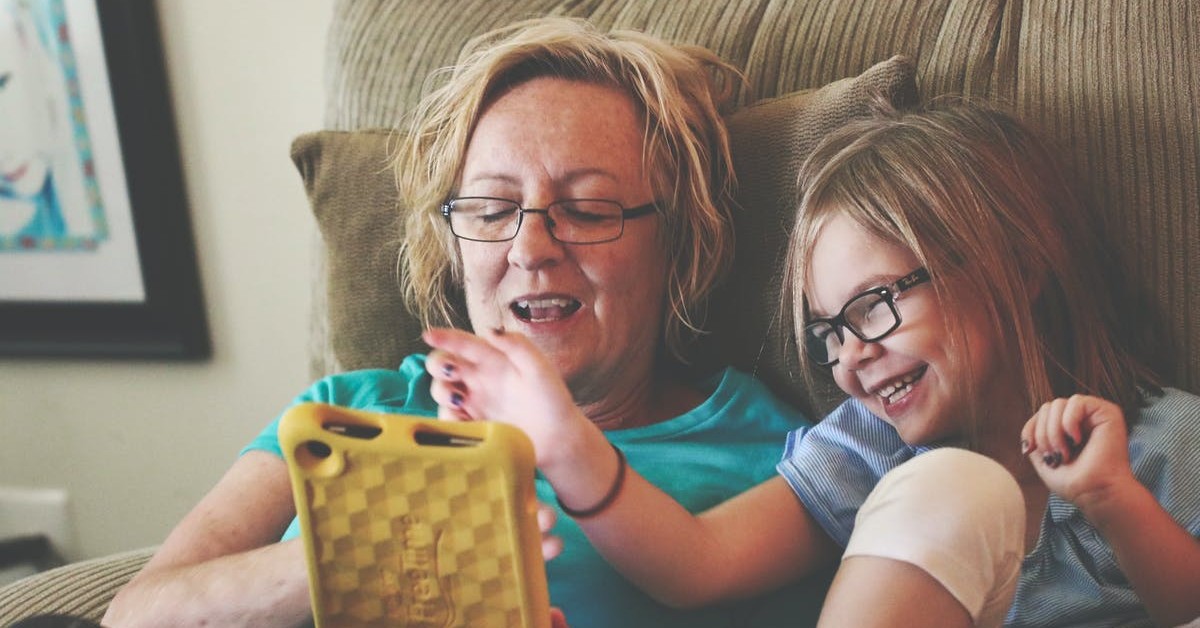
If a child is using a computer to access your course, they will probably have a parent with them who might be doing the pointing and clicking for them. But many parents load up courses for their kids on a tablet or smartphone, because the touch screens are easier for kids to control themselves.
Any good theme should be responsive, so that it adapts to the changing sizes of smaller screens. Nevertheless, you should still experiment with these designs to be sure they’re working smoothly.
Remember that the parents are the digital natives.
For years, we have all been used to thinking of kids as instantly tech-savvy. The Millennial generation grew up more technologically adept than most of their parents, and Gen Z has made a name for itself by dominating social media. But these preternaturally digital generations are now raising children of their own, which means they’re going to be far more comfortable with the Internet than their children.
This means two things for educators. First, don’t assume kids will know how your technology will work. Kids engage with technology before they understand it. If a site is loading slowly, they won’t know it has to do with the Internet and have the patience to stick around—they’ll just think it’s broken.
Second, children are fearless about testing and experimenting with functionality. They don’t realize the consequences of online actions, and they learn by doing. That means they’ll touch and click everything on the screen, just to see what happens, without worrying that they might break anything.
Design your course expecting that parents are going to be registering kids with their own email addresses and will know how to use it. You might even give them a separate login area where they can communicate with teachers or other parents. But childproof the kid-facing portion of the site so they can have the freedom to play with it without making mistakes they can’t easily recover from.

LearnDash Collaborator
@LearnDashLMS