6 Visual Design Tips to Make Your Course More Effective
When information is presented clearly and organized well, it’s easier for learners to understand and remember it.
We’ve talked a lot on this blog about the importance of good instructional design, which often focuses on how educators create course content. However, a key aspect of good instructional design is how that material is presented, visually. Online courses aren’t just about the words written on the page or the images on the screen, but about how those words and images work together to convey ideas.
This is important for instructional designers because the way content is presented affects not only a learner’s experience of a course, but also their estimation of it.
The ease with which a learner understand information is called “processing fluency.” When learners process information easily, they not only remember it better (improving their learning experience), they also regard it as more “true.” On the other hand, when it’s difficult to process information, learners struggle to remember it and view it as less credible (even subconsciously).
The lesson for educators is clear: Visual design is an essential part of a good learning experience. And, since most course creators aren’t also graphic designers, here are a few tips to set you off on the right foot.
1. Organize content so that it can be scanned in an E.
When we read articles online, we don’t approach it the same way we would a book. When we read a book, we start on the first page and read through the pages in sequence until we reach the end. But many online readers tend to follow a skimming pattern, where they read the headline and skip over headings to make sure they’re on a relevant resource before returning to the top and reading an article in full.
Even those readers who don’t process information this way on their first read-through will do so when they go back to revise.
When you’re organizing your course content, use titles and headings to convey the most important information in your article. Even if a learner doesn’t read an entire article, they should be able to grasp the key points from the title and headers alone. If there are points you want to add emphasis to, use pull quotes, images, and bullet lists.
2. Use clean, proportional fonts.
If you’ve ever opened a drop down list of font choices, you may have found yourself drawn to some of the more exciting or unusual options—ones that look graceful, or bold, or fun. These fonts have a specific purpose in graphic design, and are used mainly for logos, signs, or visual art. Some can even be used sparingly in titles or headers.
However, many aren’t good choices for body text. Because boy text is smaller and denser than header text, it’s important to choose a font that is easy to read.
Both serif and sans serif fonts are good choices, and you can even use one font for body text and a different font for header text (although more than two fonts is a bad idea unless you’re a graphic designer and know what you’re doing). However, you should avoid monospaced fonts, like Courier (or any typeface which uses the word “mono” or “typewriter”).
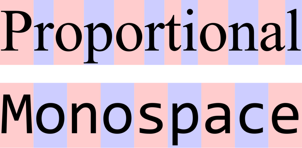
Monospaced fonts use the same amount of space for each letter, whereas proportional fonts vary the spacing for each letter based on how wide or thin it is. Old typewriters used to be monospaced, and some fonts follow this design choice to achieve a retro effect. However, monospaced types are a little harder to read, and are better avoided for body text.
Sans serif fonts:
- Helvetica
- Lato
- Lucida Sans
- Open Serif
- Roboto
Serif fonts:
- Baskerville
- Garamond
- Georgia
- Lucida Serif
- Times New Roman
3. Use a high contrast between text and background.
Another area where course creators can run into trouble with their graphic design choices is with their background and font colors. Let’s say your brand colors are green and orange. These colors are near-opposites on the color wheel, but that doesn’t mean they’re going to contrast enough not to run into legibility issues.
All colors have three defining characteristics: hue, value, and saturation. Hue is what you think of as “color”—blue, red, green, yellow, cyan, magenta, etc. Value has to do with how light or dark a color is, while saturation or “chroma” has to do with how intensity.
Tangerine orange text on top of a neon green background is going to be tiring to read even though the hues are different, because the value and chroma are too similar.
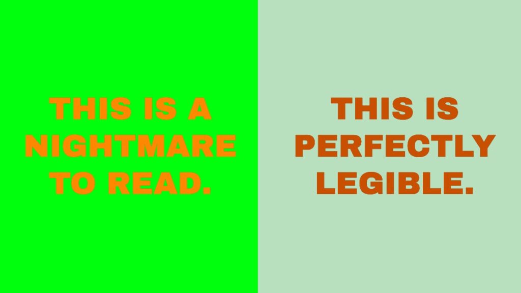
On the other hand, if you make the green lighter and less intense, and make the text darker, you’ll end up with something that isn’t so painful to the eyes.
Of course, the safest bet is always black and white. If you want to soften the look a little, you can do so, but any time you lower the contrast you should make up for it by increasing font size.
4. Use a large font size and allow for plenty of white space.
White space refers to the open, “unfilled” areas of a page that give visual elements, like text and images, room to breathe. Whenever you include a graphic element on a page, you should be careful not to crowd it in with other elements. Large font sizes increase the white space on your screen and aid readability. If you have a page with a lot of extra side bars and widgets, it can lead to visual clutter which distracts learners and makes it harder for them to focus on the course materials.
In fact, this is why we included the Focus Mode feature in LearnDash. When Focus Mode is enabled, it automatically removes the main navigation, footer, and any additional side bars from the screen so that the learner can focus entirely on lesson content. You can think of it as instantly creating white space for your learners, so that they can more easily absorb your lessons.
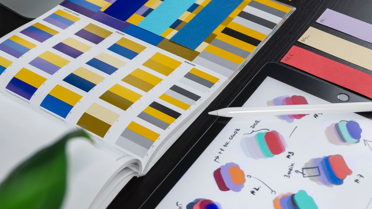
5. Choose images that are relevant and attractive, and place them close to ideas on the page.
Images make content more memorable by giving learners a mental reference point for what they’ve just learned, almost like a mnemonic device. If you’re trying to remember what you learned, recalling the picture that was on the page when you read it can help.
It shouldn’t be just any picture, however. The picture should be relevant to the content, even if it’s a little abstract. The more clearly the image is related to the course, the more it will help reinforce learning.
Just as importantly, it’s worthwhile to invest in attractive images. Dated stock photos can make your course look old and out of touch, and can subtly suggest to learners that it isn’t as trustworthy.
Where you place an image on a page is just as important as including one in the first place. Keeping images close to the concepts they reference is important, and if you have two dissimilar ideas, you should keep those images farther apart.
6. Stay Consistent.
Finally, don’t change your visual style from lesson to lesson. Stick with your color palette and fonts, and as much as possible maintain a consistent visual style for your images.
Take it a step further my using similar formatting for similar learning elements. If you make a simple graphic using an image and a pull quote, create a template for the future so that you can easily update the image and quote while keeping other style elements similar.
Doing so will help learners recognize key information points, and pay closer attention when something is formatted a certain way.
When in doubt, simplify, spread out, and make it bigger.
When you’re creating content online, you don’t have the same physical space limitations as if you were printing something out. If you’re creating slides for a presentation, add more slides before you start cramming too much information onto one. If you feel like there’s too many visual elements on the screen at one time, spread them out so that they’re not crowding each other, or start eliminating them. And if you have any key messages for your learners, don’t hide them in the footnotes—make them headlines, pull quotes, or visual graphics.

LearnDash Collaborator
@LearnDashLMS